
How to Read Candlestick Charts In Crypto Trading Like a Pro

.png)
Understanding Candlestick Charts
Did you know that candlestick charts appeared over three centuries ago? The candlestick chart was invented in the 1700s by a Japanese rice trader — Munehisa Homma (or Homna, also known as Sokyu Honma or Homma). He used the candlestick elements (Open High and Close Low) to represent the prices in a trading period.
Today, almost all financial markets rely on candlestick charts for price representation.
But how do they work?
Read on as we explain everything you need to know about candlestick charts, including how to read and trade with them for profit.
What Is Technical Analysis?
Technical analysis is a trading approach that analyzes financial instruments such as stocks, commodities and digital currencies through past price data and trading volumes. Market participants like traders and investors use technical analysis to pinpoint patterns and market movements that can guide them in choosing when to purchase, sell or hold a particular asset.
In contrast with fundamental analysis, which delves into the inherent value of an asset by evaluating a company's financial well-being, sector trends and other qualitative aspects, technical analysis focuses primarily on asset price and volume information.
What Do Crypto Charts Tell Traders?
Crypto charts provide traders with a visual representation of valuable information about the historical and current price movements of cryptocurrencies, as well as their trading volumes. Analyzing these charts allows you to gain insights into the market's behavior so you can make more strategic investment decisions.
Key elements that crypto charts reveal include price trends, support and resistance levels and momentum indicators. These charts unearth patterns based on previous price action, providing a large context for information from indicators like Bollinger Bands®, moving averages and the relative strength index (RSI). Each chart pattern serves as a tool for identifying potential investment opportunities.
Using Trend Analysis to Understand Bull and Bear Markets
Trend analysis is essential for understanding bull and bear markets, as it assists traders and investors in determining the market's overall direction. Market participants can make educated investment choices by recognizing and interpreting these trends. Here's how trend analysis can aid in understanding bull and bear markets.
Bull market: A bull market features a continuous uptrend in asset prices, driven by increasing investor confidence, optimism and positive market sentiment. In a bull market, demand for assets generally outstrips supply, leading to rising prices. Trend analysis can help identify the start and continuation of a bull market by revealing higher highs and higher lows on the price chart. Traders may anticipate further price increases, finding opportunities to buy or go long on assets.
Bear market: A bear market is marked by an extended downtrend in asset prices, coupled with pessimism, waning investor confidence and negative market sentiment. In a bear market, the supply of assets exceeds demand, pushing prices lower. Trend analysis can reveal signs of a bear market and its potential duration by showing lower highs and lower lows on the price chart. Traders may expect additional price declines and consider selling or going short.
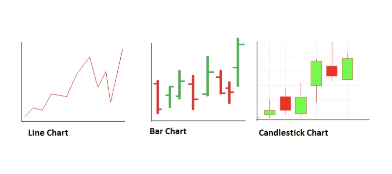
What Is a Candlestick Chart?
A candlestick chart is a combination of multiple candles a trader uses to anticipate the price movement in any market. In other words, a candlestick chart is a technical tool that gives traders a complete visual representation of how the price of an asset has moved over a given period.
The candlestick chart is a crucial price action tool that shows detailed information about price, including the open, close, high and low for a particular time frame. Still, it’s confusing when compared side-by-side with a bar chart.
Here’s an example of the bar chart and candlestick chart:
TopStockResearch
The bar chart and the candlestick chart may look similar, but there’s indeed a difference. In a candlestick chart, the relationship between open and close is represented by the color of the body. In contrast, the bars have a single vertical line and two horizontal lines on either side of the vertical line.
When an appropriate candlestick pattern forms on a price chart, crypto traders can anticipate price continuations or reversals. Therefore, both a single candlestick and a group of candlesticks are essential to define a crypto trading asset’s upcoming price movement.
Elements of Crypto Trading Charts
A comprehensive understanding of crypto trading charts is essential for anyone delving into cryptocurrency trading. These charts offer valuable insights into the market dynamics of digital assets, allowing traders to act decisively and capitalize on potential opportunities. Here's a breakdown of the critical components found in a typical crypto trading chart.
Trading Pair: The trading pair represents two cryptocurrencies that can be exchanged for one another on a trading platform (e.g., BTC/ETH or BTC/USD). The first crypto quoted is usually the base currency, and the second crypto is the quoted currency.
Current Price, Mark Price, Last Traded Price: The current price reflects the trading prices currently available for both buyers and sellers, as reflected by the bid and ask of the market. The mark price, also known as the fair price, is an estimated value that aims to provide a reasonable price valuation. It’s sometimes derived from an average across multiple exchanges or a combination of spot prices. Finally, the last traded price refers to the price at which the asset was traded in the most recent transaction.
Learn more: Mark Price vs. Last Traded Price
High/Low: The high and low prices indicate the maximum and minimum values reached by the trading pair during a specific time frame (e.g., 24 hours, one week, or one month).
24-Hour Volume: The 24-hour trading volume represents the total amount of the trading pair exchanged within the past 24 hours.
Unit of Time: The unit of time corresponds to the time intervals displayed on a crypto trading chart, such as 1-minute, 15-minute, 1-hour or 1-day intervals.
Price Chart: The price chart is a visual representation of the historical and current price movements of the trading pair over the selected time frame.
Trading Volume: Trading volume is the total quantity of the trading pair exchanged during a specific period, typically shown as a bar chart below the price chart.
Limit Order: A limit order allows a trader to specify the maximum or minimum price at which they are willing to buy or sell a cryptocurrency.
Stop-Loss: A stop-loss order is an order type that automatically sells a cryptocurrency when its price drops to a preset level, helping to minimize potential losses. Moving Average (MA) Line: The moving average line is a technical indicator that calculates the average price of a cryptocurrency over a specific period, smoothing out price fluctuations and revealing the underlying trend. Common moving averages include the simple moving average (SMA) and the exponential moving average (EMA).
The Anatomy of a Candlestick
Firstly, let’s have a look at a visual look of a candlestick:
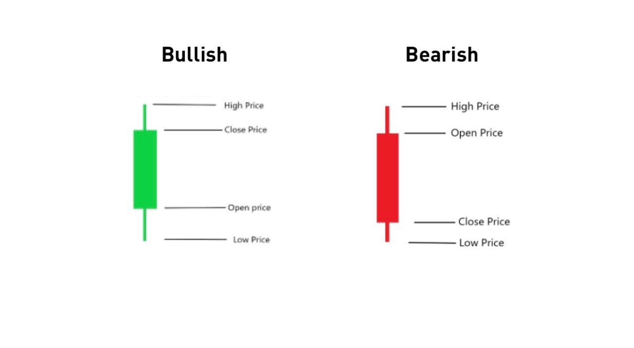
Above we can see a bullish and a bearish candlestick, with opening and closing prices in opposite directions.
The main body is the broader part of the candlestick that shows the opening and closing prices. In a bullish candle, the opening price is below the closing price, indicating the price has risen over the trading session’s period.
On the other hand, the opening price is above the closing price in a bearish candle, showing that the price has decreased during the trading period.
The length of the candle’s body represents the market pressure. An extended length indicates strong movement, while a short length represents minor price movement.
Now, let’s learn how to read the red and green candlesticks in any crypto pair.
Typically, the green color (or buying pressure) of a candle represents a bullish candlestick, and red indicates a bearish candlestick. However, you can change the color at any time according to your choice and trading template.
The wick is the thinner part of the candlestick, attached above and below the candle body. The wick above the candlestick’s real body indicates the highest price level during the trading time frame.
Opening High and Closing Low Price (OHLC) Explained
An OHLC (open-high-low-close) candlestick chart type shows the open, high, low and closing prices for a particular time period.
The open level is the price at which the previous candle closes. This price will move up or down, and will create a new high or low. When the candle closes, it will point to a new closing price. The future price of a candlestick stock depends on how these levels (OHCL) appear.
Let’s take a look at an example.
Let’s say that Bitcoin’s price has moved above $30,000 on a particular day, making a high above the crucial $30,000 level. However, the price then moves lower and closes the daily candle below $30,000 by forming a Doji or pin bar pattern.
What does this mean for you?
It simply means that buyers tried to take the price above the $30,000 level but failed, and sellers thus took control over the price. This is a clear indication that the price has failed to achieve stability above $30,000, and that it may be a good idea to sell now.
Identifying Candlestick Patterns
Each candlestick forms patterns that traders can use to recognize major support and resistance levels. A great way to start is to first identify the candlestick patterns. Here’s what you need to know.
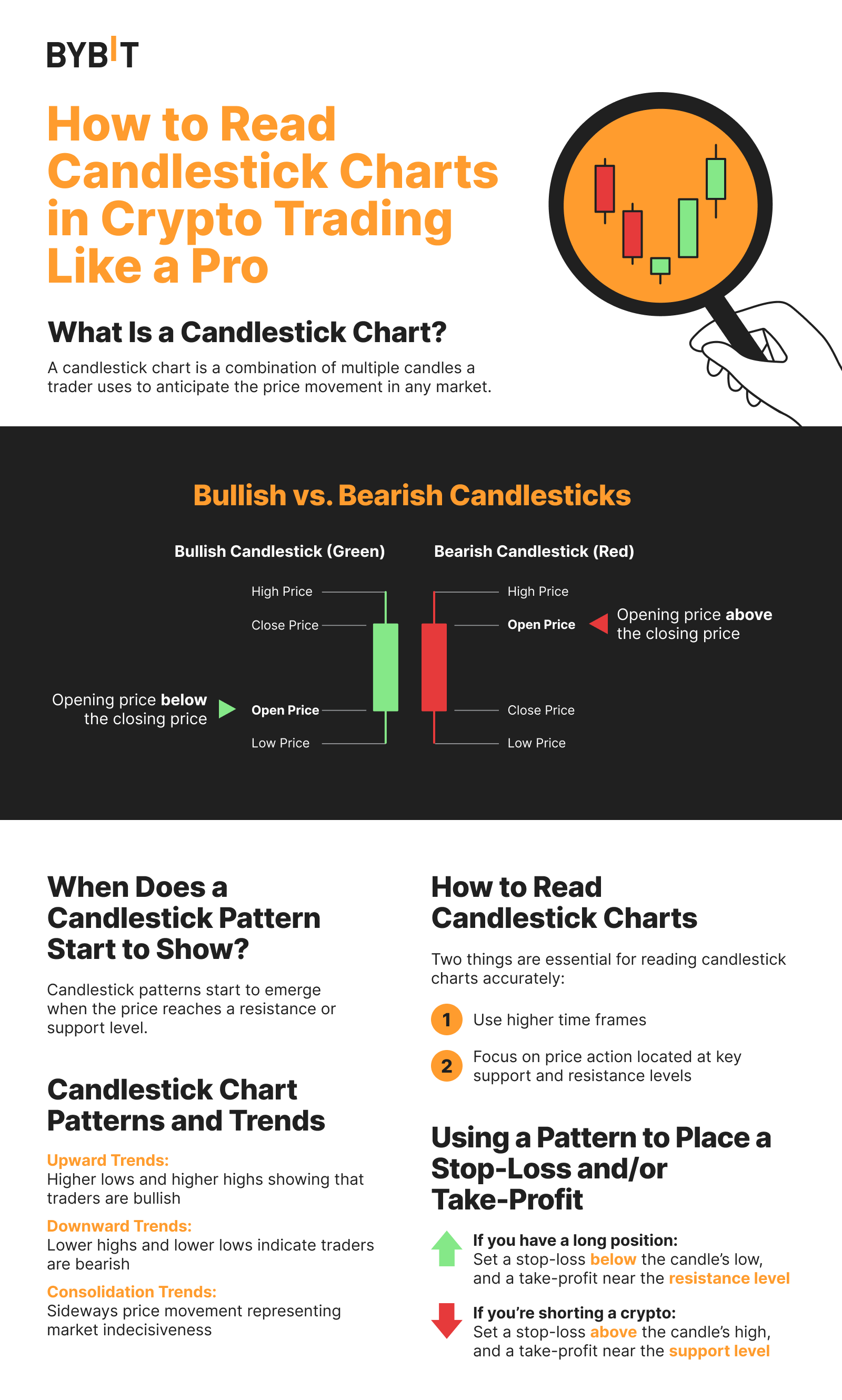
When Does a Candlestick Pattern Start to Show?
Candlestick patterns are a combination of some candlesticks representing a story about buyers and sellers for a particular time. However, price movement in financial markets depends on both supply and demand, and on traders’ emotions (which create “market sentiment,” or the market’s overall tone or mood). As soon as the price reaches a resistance or support level, candlestick patterns will start to emerge.
Therefore, when a price moves to a significant zone, candlestick patterns will become very important.
For example, Bitcoin’s high psychological level of $60,000 in the spring of 2021 became a strong resistance level that attracted many buyers and sellers.
Let’s look at the BTC/USD graphic below.
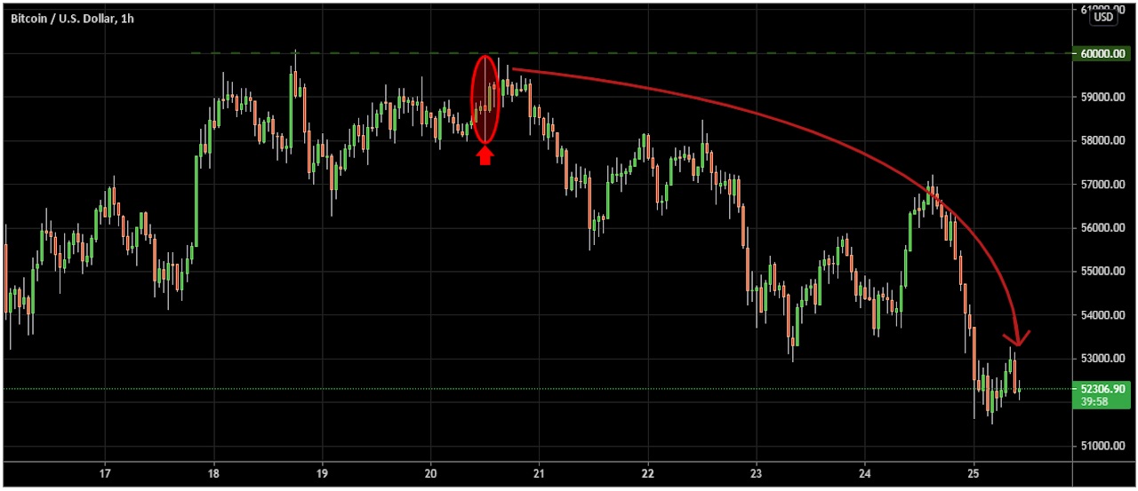
Bitcoin creates an indecisive candle near the significant round number of $60,000, indicating a starting point of a pullback. Its price then falls with an impulsive bearish pressure toward the downside.
So, what will you do if you find an appropriate candlestick pattern at a critical support or resistance level?
You should closely track buyers’ and sellers’ activity, and enter a trade once the direction is set. The best solution is to wait for an appropriate candlestick pattern at either a support or resistance level, and enter your trade after a rejection.
Understanding Candlestick Chart Patterns and Trends
Trends are usually represented by the ups and downs of an asset’s price on the candlestick chart. The high and low points of several small trends are grouped to form a more significant trend.
Upward Trends: These appear when a chart has new low points, higher than the previous lows, and new high points that are higher than the previous highs. During an upward trend, traders are confident to trade, and the market is generally bullish.
Downward Trends: As opposed to upward trends, a downward trend’s chart has new high points, lower than previous high points, and new low points that are also lower than previous low points.
Consolidation Trends: The prices in a consolidation trend don’t move consistently in one direction. Instead, the movement switches between high and low, with the high and low points being relatively close to one another and forming a “channel.”
How to Read Candlestick Charts
Candlesticks charts are like books in which a trader can easily read the price from left to right. They’re not technical to read, but there’s a learning curve to analyzing the chart.
There are no specific rules, but it’s recommended that you start reading candlesticks from the far left until you see the first candlestick. Focus on the speed of the trend and candlestick formation at its end.
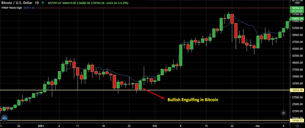
Let’s take a look at a practical example to understand better.
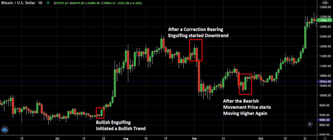
Here we can see a daily Bitcoin chart in which the price has started to move higher with a bullish engulfing pattern. Later on, the trend corrects and moves lower. The price then forms another bullish engulfing pattern, moves higher and forms a new high.
Still, the best way to interpret the data of a candlestick chart is by using technical tools, such as stochastic and RSI indicators and moving averages, for an accurate price direction.
Important Note:
To read the candlestick chart accurately:
1. Use higher time frames
2. Focus on price action located at key support and resistance levels
Trading Time Frames
Time frames are an essential tool for traders. Although there are candlesticks patterns in all time frames resulting from the price movement, there’s technically no difference from higher to lower time frames.
However, higher time frames generally provide a more accurate price direction than the lower time frames. Therefore, if you trade any cryptocurrencies intraday, you should view the price direction daily or using H4 candles (four-hour intervals). When the lower time frame and higher time frames match directions, you can find profitable trades.
Price Action
A hammer is a reversal candlestick, but does this mean you need to sell immediately as soon as you see a hammer candlestick on a chart?
The answer is no.
Candlestick patterns at a random place on your price chart don’t necessarily provide accurate signals. However, a candlestick pattern within a trend — and at a perfect location — can provide you with high-probability trades.
Therefore, always look for the support and resistance levels on a chart. Moreover, it helps if you consider the market context and the overall trading environment to increase your odds of success.

In the above BTCUSD chart, we can see a bullish engulfing pattern at the $30,000 level. However, after the bullish engulfing bar, a bullish shooting star appears, and it fails. This is because it’s randomly placed, instead of at a support or resistance zone.
Here are some other considerations.
Impulse price movement: When the price moves with a solid bullish or bearish pressure, it aggressively creates new highs or lower lows.
Correction movement: After a breakout, the asset will fall into a correction state in which the correction price becomes lower.
Volatility: In a volatile market, the price action breaks recent highs and lows but doesn’t set any direction.
Non-volatility: In a non-volatile market, the price aggressively moves higher or lower, indicating solid market dominance.
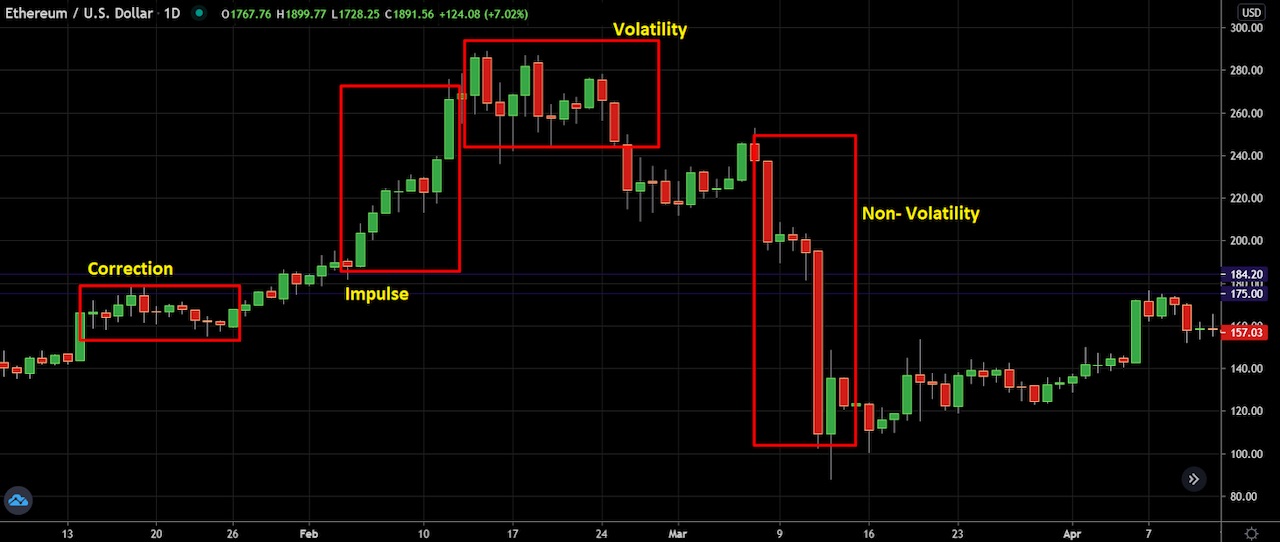
The ETH/USD price chart above shows the four different types of price actions. If you can match the context with the candlestick formation, you can easily define the possible price movement in any asset.
How to Use a Pattern to Place a Stop-Loss and/or Take Profit
Having a stop-loss is an essential risk management tool for crypto trading in order to limit your losses on an open position. The key advantage of using a stop-loss order is that it helps you cut your losses without having to monitor your assets daily. Without a stop-loss, you’re risking your investments.
The ideal place for setting a stop-loss is below or above the candle’s low/high, with some buffer.
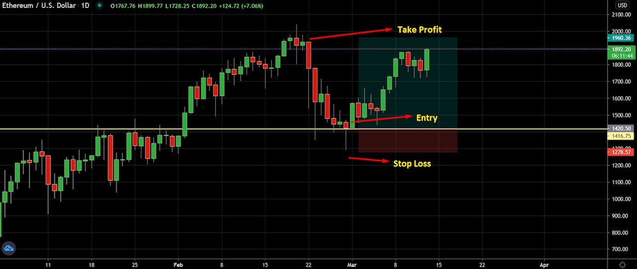
For example, in the ETH/USD chart above, we can see a hanging man pattern formed at a critical support level, indicating a potential bullish movement in the price. The ideal stop-loss should be below the candlestick pattern with some buffer, and the take profit would be near the resistance level.
Popular Candlestick Patterns
There’s no denying that candlestick patterns play a significant role in technical trading. A candlestick pattern is especially useful for determining possible price movement and market trends, based on past patterns.
Of course, there are also a variety of candlestick patterns that signal bullish and bearish movements. But, which are the best candlesticks to use?
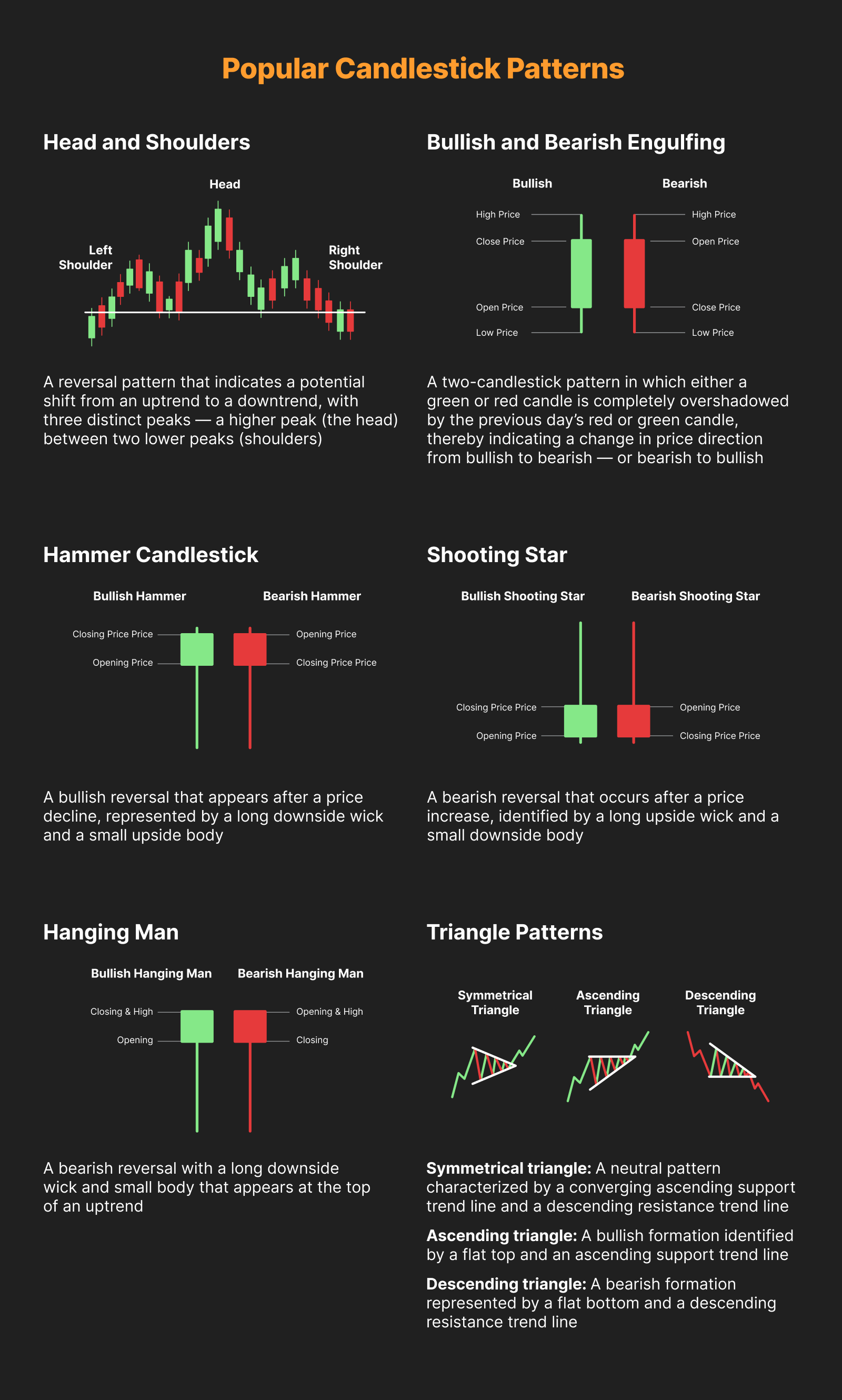
Head and Shoulders
The head and shoulders pattern is a trusted reversal pattern that indicates a potential shift from an uptrend to a downtrend. It consists of three distinct peaks — a higher peak (the head) between two lower peaks (shoulders). This pattern is completed when the price falls below the neckline, which is a support level formed by connecting the lows of the two shoulders. As a reversal pattern, the head and shoulders is most effective when used in the context of an existing uptrend.
Bullish and Bearish Engulfing
The bullish engulfing candle pattern consists of a combination in which the first candle is red (bearish). After the red candle closes, a green candle appears, engulfing the body of the previous candle and closing above its high. On the other hand, the bearish engulfing candle is the opposite of the bullish engulfing candle, with a green candle appearing first and a red candle engulfing the body of the first green candle.
Did You Know?
The engulfing pattern indicates price direction changes from bullish to bearish — or bearish to bullish — as soon as the candle closes above or below the previous candle’s closing price.
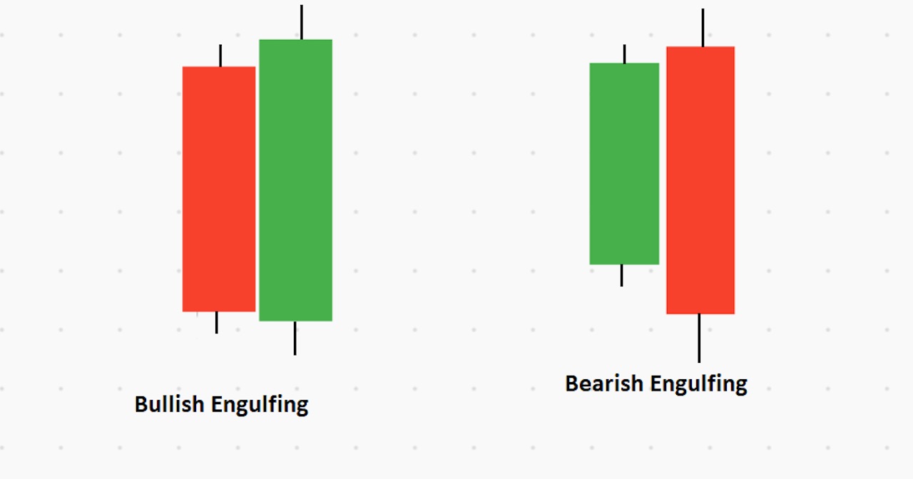
In the image above, we can see how an engulfing candlestick pattern forms in the market.
The engulfing pattern at a strong support level works as a vital price reversal zone in the following price chart.
Hammer Candlestick
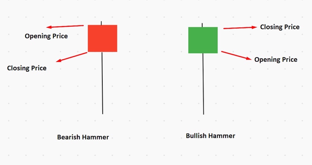
The hammer candlestick has a long downside wick, and a bullish or bearish small body to the upside. This type of candlestick usually indicates an asset’s exhaustion in the market, meaning there will be an upcoming trend reversal. This means that sellers have entered the market, pulling the price down, but are being countered by buyers who drive the price up.
The ideal price location of the hammer candlestick pattern is at the end of a downtrend.
If you want to open a trade based on the hammer candlestick, wait for the candle to close before entering a trade. Once the price breaks above the candle’s high, then it’s time to enter.
Learn more: How to Trade with Hammer Candlestick
Shooting Star
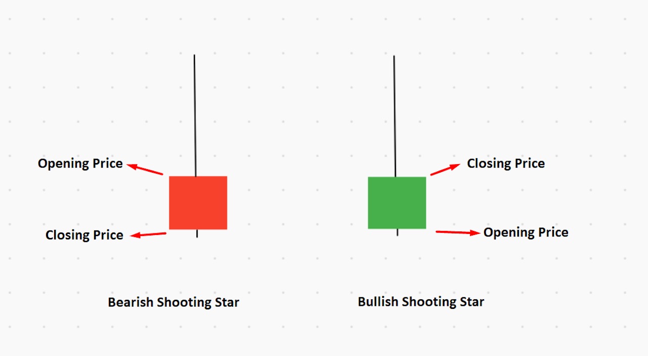
The shooting star candlestick is the opposite of a hammer candlestick. It can be recognized by its long upside wick and small downside body. If you find the bullish or bearish shooting star at any important resistance level, it indicates a potential selling opportunity to consider.
The ideal price location of the shooting star pattern is at the end of an uptrend.
Learn more: How to Use Shooting Star Candlestick Pattern to Find Trend Reversals
Hanging Man
Hanging Man is like the hammer candlestick, with open, high and close prices that are almost the same. There should be a long shadow (wick) to the hanging man candlestick, at least two times higher than the candle’s body.
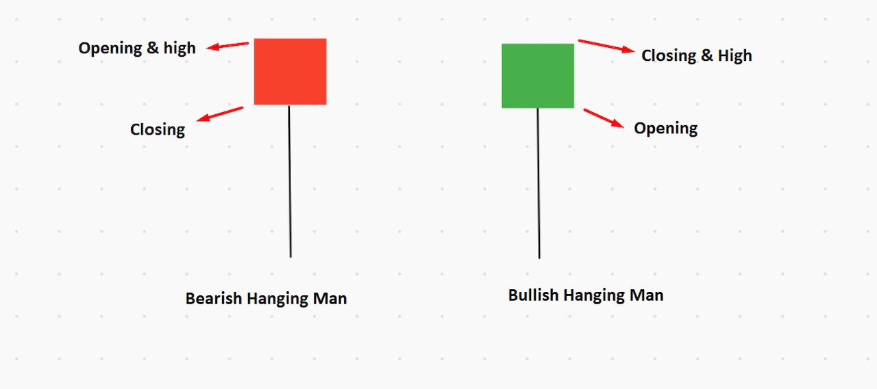
In the bearish hanging man, the opening and high prices are the same, whereas, with the bullish hanging man, the closing price and high prices are the same.
Learn more: How to Use Hanging Man Candlestick Pattern to Trade Trend Reversal
Triangle Patterns
Triangle patterns appear when buyers and sellers become indecisive about the market. Hence, the price starts to squeeze.
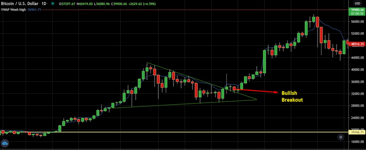
In triangle patterns, the price moves within two parallel trend lines that begin squeezing together. There are three types of triangle patterns in the financial market.
Ascending triangle: A bullish formation that indicates a potential upside breakout. The ascending triangle can be identified by a flat top and an ascending support trend line.
Descending triangle: A bearish formation of the pattern that indicates a potential downside breakout. The descending triangle can be identified by a flat bottom and a descending resistance trend line.
Symmetrical triangle: The price begins to narrow, and may move up or down after the symmetrical triangle breakout. The pattern can be identified by an ascending support trend line and a descending resistance trend line.
The chart above shows a real example of a symmetrical triangle on a daily Bitcoin chart. The price makes both lower highs and higher lows within the pattern, then breaks above the pattern and initiates a strong bullish movement.
Pros and Cons of Using Candlestick Charts
Candlestick charts are an excellent tool traders can use to interpret possible market trends and make strategic decisions. Still, there are limitations to be aware of.
Advantages
A picture is worth a thousand words: Candlestick chart offer more accurate view of the price
Candlestick charts are easy to understand, with no need for advanced skills
Prices are easily predictable with visible buyers’ and sellers’ activity
Candlestick charts show potential buying and selling opportunities from solid price levels
Limitations of Candlestick Charts
Although Candlestick charts show buyers’ and sellers’ activity in the price, they don’t indicate market volume
Candlestick charts don’t rely on market fundamentals, but rather the price reaction to them
Candlestick patterns at random places on a price chart often provide false directions
Using candlestick charts without other info can lead to “paralysis by analysis”
Did You Know?
“Analysis paralysis” refers to a situation in which an individual or group has difficulties moving forward with a decision due to overanalyzing data or overthinking a problem.
The Bottom Line
In a nutshell, that’s how to start reading candlestick charts. Which candlestick pattern can you identify? How can you translate this information into profits?
Finally, we’re at the end of this trading guide on candlestick charts. It’s time to summarize what we’ve learned:
A candlestick chart is a combination of multiple candles that a trader uses to anticipate price movement
Popular candlestick patterns are engulfing, hammer, shooting star, hanging man and triangle patterns.
Consider an asset’s price trend and levels while using candlesticks to project price direction
Candlesticks charts are an effective tool to use in financial markets, and most traders in the world use them. You can consider the candlestick trading system as an individual trading strategy, or you can use these tools as part of your strategy to increase your trading success.
Candlestick Patterns Professional Traders Use
Best candlestick patterns – A curated list of candlestick patterns most frequently used by traders
Crypto Chart Patterns (Chart basics: trend, neckline, wedges)
Doji Candlestick – Basic candlestick unit
Bullish candlestick patterns
- Inverted Hammer Candlestick
- Bullish Engulfing Candlestick
- Cup and Handle Patterns
- Morning Star Pattern
- Three White Soldiers Pattern
- Hammer Candlestick
- Triple Top Pattern and Triple Bottom Pattern
- Falling Wedge Pattern
- Dragonfly Doji Candlestick
Bearish candlestick patterns
- Bear Flag Patterns
- Gravestone Doji Candlestick
- Head and Shoulders Pattern
- Dark Cloud Cover Pattern
- Shooting Star Candlestick
- Rising Wedge Pattern
- Hanging Man Candlestick
- Bear Pennant Pattern
- Evening Star Pattern
- Triple Top Pattern and Triple Bottom Pattern
Other candlestick patterns
- Harami Candlestick – Has both bullish and bearish candlestick
- Hammer Candlestick – Has both bullish and bearish candlestick
- Double Top and Double Bottom – Has both bullish and bearish candlestick
- Spinning Top Candle – Has both bullish and bearish candlestick
- Marubozu Candlestick Pattern – Has both bullish and bearish candlestick
- Tweezer Bottom Pattern – Has both bullish and bearish candlestick
- Continuation Patterns – Determining a continuing trend
#Bybit #TheCryptoArk